Pricing Page Magic Tricks

We think that when we’re evaluating prices for different apps and doing all the research before selecting those subscription models, that we’ve thought long, hard and rationally enough. No one can fool us.
Wrong.
I love it when I spot psych & behavioral economics principles on user interfaces. I hate it when they actually work and get the best of me! As I was evaluating pricing models for survey tools the other day, I realized just how I was tricked into buying what those clever marketers lured me into choosing. I have to hand it to them though: I was aware of the psychological tricks they used, but boy did they get me! Here are top 3 of my favorite (and simplest yet cleverest) pricing magic tricks out there.
The Popularity Contest
Introvert or not, we’re all social beings. The most recommended dishes sell out faster in restaurants and so too do the “most popular” plans. Humans will follow the options most others follow. But are they really the most popular or did they just become most popular because of the most popular label? We’ll never know.
Box’s pricing plan not only notes what’s most popular, but also highlights the plan they want you to choose. Simple but effective.

The Hidden Values
Okay, this was the “survey tool” I was talking about above. They tell me I get the best value from Advantage price of $34/month billed annually. Of course that’s better than the $35/month option to the left. Why would I ever choose Standard?
But if you look closely, the standard pack is billed monthly. You have to click something extra to see the Standard Annual price.

Now if we delve deeper into the fine print at the bottom of this page, we see that the Standard Annual Plan actually costs $31/month when billed annually, actually $3 cheaper than the Advantage Annual Plan.

Evil monkey. Evil! (But smart I gotta tell ya)
The Decoy Effect
[Images from Google Images]
Ah, my favorite of them all. The Decoy Effect.
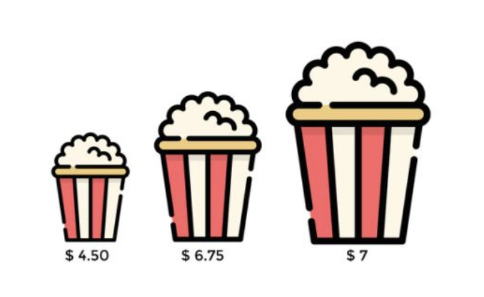
Check out these popcorn prices.

Why the heck would I buy the useless $6.75 option when there’s a $0.25 more expensive option that’s a much bigger size? Ah hah. That $6.75 option isn’t actually so useless. It’s there to make us value the $7 option as more worthy to buy. If the middle option were missing, we would be less likely to buy the $7 popcorn because we only had the $4.50 option to compare it with.
Here’s another example to illustrate.

The Economist conducted a study with their subscription model. They offer a web only option ($59), a print option ($125) and a print + web option ($125). The print option is obviously dumb. Why would anyone buy that if there’s an equally priced option that includes so much more?


When the print option was missing, the print + web subscription had a 32% rate. When the print option was added, that number grew to 84%. A simple, fake decoy can do the trick.
What are some of your favorite pricing model tricks?