Color Theory Analysis

Co-founder at King’s Cross Labs · ex-LinkedIn PM & Forbes 30 Under 30
Send this guide to yourself
Get the link in your inbox so you can read it whenever you're ready.
Your email will also be saved for future updates.
I wanted a color analysis that was visual, clear, and actually useful.
So instead of asking for only a seasonal label, I asked ChatGPT to generate a full stylist-style breakdown with try-ons, palettes, and comparisons.
The key was being specific about output quality, structure, and realism.
When the prompt is detailed, the result is much easier to use in real life.
Prompt to use
Perform a professional, in-depth personal color analysis on the person in this photo. Output in an image with all the information.

1. Determine their seasonal color type (e.g., True Spring, Soft Autumn, Cool Winter, etc.) based on skin undertone, contrast level, hair, and overall harmony. Clearly label the result.

2. Generate a complete color palette tailored to them, including:
- Core best colors (dominant palette)
- Best neutrals
- Supporting/accent colors

3. Create visual try-ons:
- Replace the person’s clothing in the image with each of the recommended colors from their palette
- Show multiple variations so each color is clearly represented on the subject
- Keep lighting, skin tone, and realism consistent across all variations

4. Style recommendations (visually illustrated where possible):
- Best metals (e.g., gold, silver, rose gold)
- Ideal hair tones (with visual swatches or applied examples)
- Makeup palette (foundation undertone, blush, lipstick, eyeshadow)

5. Contrast with “worst colors”:
- Identify colors that clash with their undertone or overpower their features
- Create side-by-side visuals showing the subject wearing these unflattering colors
- Ensure the comparison clearly highlights why these colors are less suitable

6. Output format:
- Produce a clean, well-designed set of 3–5 visual boards/images (not one crowded image)
- Separate sections such as:
  • Profile + palette overview
  • Best colors (with outfit variations)
  • Neutrals, metals, hair, makeup
  • Colors to avoid (with comparisons)
- Use a polished, editorial or infographic style (similar to a professional stylist or fashion guide)

7. Overall goal:
Create a visually compelling, easy-to-understand color analysis that clearly shows transformation, contrast, and styling guidance—not just static swatches.

Additional instruction:
Prioritize photorealistic rendering, accurate skin tone preservation, and consistent facial features across all variations.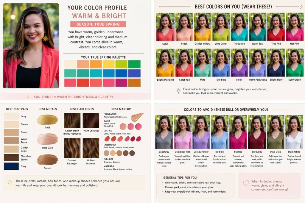
Additional Reading
Here are some related guides to check out:
Frequently asked questions
- How do I get a color analysis from ChatGPT?
- Upload a clear photo and paste a detailed prompt asking ChatGPT to determine your seasonal color type from your undertone, contrast, and hair, then generate a full palette, outfit try-ons in your best colors, and colors to avoid. The key is being specific about output quality, structure, and realism: a vague ask gives a vague label, a detailed one gives a usable visual guide. The guide includes the exact prompt to copy.
- Can AI show me what colors look good on me, not just name my season?
- Yes. The point of this prompt is visual try-ons, not just a seasonal label. It replaces the clothing in your photo with each recommended color so you can see the palette on yourself, plus side-by-side comparisons of colors that clash. Ask it to keep lighting, skin tone, and realism consistent across every variation so the comparison is honest.
- How do I keep the color analysis looking like the real me?
- Add the instruction to prioritize photorealistic rendering, accurate skin-tone preservation, and consistent facial features across all variations. It's built into the prompt for exactly this reason. Without it, the model can drift into a stylized or altered version of you, which makes the try-ons useless. Keep your original photo as the unaltered reference.
Want to build your first AI agent?
Build Your First Agent 101 is the next step! You'll get step by step guides, video tutorials and starter prompts to create your first agent in half a day, customized to your own workflow.
Learn more