How to Spot AI-Made Graphic Design and Posters

Co-founder at King’s Cross Labs · ex-LinkedIn PM & Forbes 30 Under 30
Send this guide to yourself
Get the link in your inbox so you can read it whenever you're ready.
Your email will also be saved for future updates.
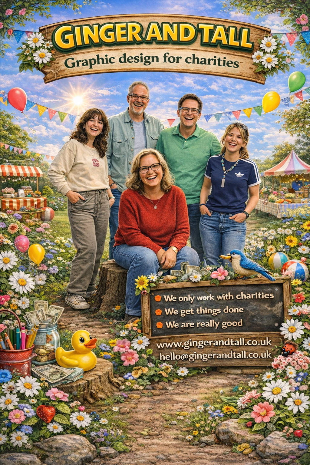
You can spot an AI-made poster in about a second, even when you can't say why. The tell is almost always the same thing: too many inconsistent details competing for your attention at once.
I know because I spent the start of my career in product design, so my eye is trained to catch what feels off. Your audience catches it too, they just can't name it. That unnamed "something is wrong here" feeling is what costs you trust before anyone reads a single word.
Good design is invisible. When every choice lines up, people feel calm and they believe you. When the choices fight each other, people feel a low hum of doubt, and doubt is expensive when you are trying to sell, teach, or get someone to follow you. Here are the six tells I look for, with real examples, so you can catch them in your own work before you hit post.
How do you tell if a poster was made with AI?
Run through these six checks. Most AI posters trip at least three of them, and once you see the pattern you can't unsee it.
1. There's no white space. White space is intentional emptiness, and it's what lets a design breathe. AI fills every pixel because it has nothing telling it to stop, so the result feels crowded and chaotic. If your eye doesn't know where to rest, that's the first tell.
2. There's too much information in tiny text. AI loves to pack in a full paragraph and then shrink it to fit. You end up squinting at an infographic to read anything. A human designer cuts words so the important ones can be big. AI keeps them all and makes them small.
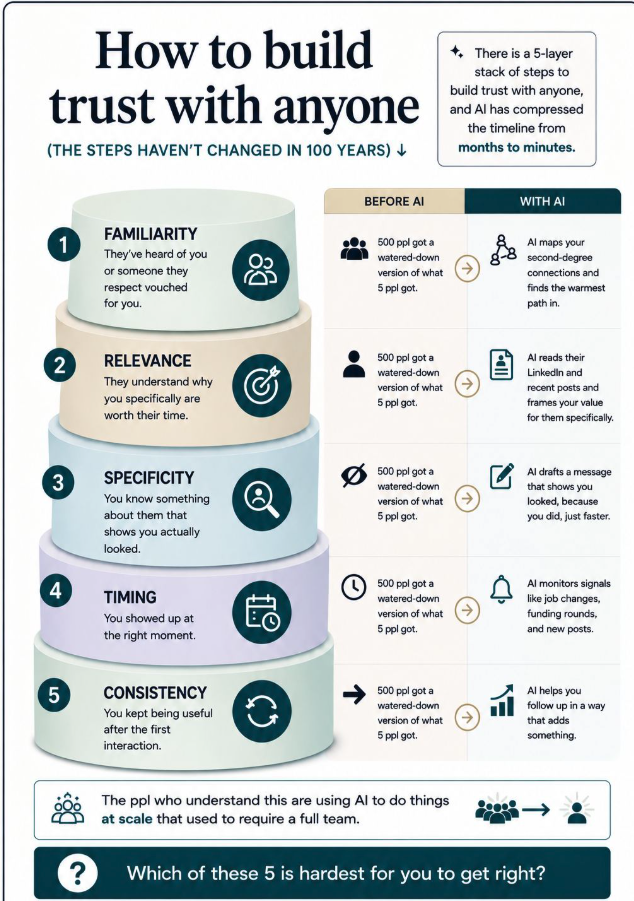
3. The fonts don't match. Look at how many different typefaces are fighting on one AI poster, in different sizes and different families, with no logic to which is which. A real brand uses two, maybe three fonts on purpose. AI mixes five because each one looked good on its own.

4. The art styles don't match. This one is the fastest giveaway. On the live comedy poster below, the "every Thursday 8pm" block is a flat vector style, the microphone is rendered in realistic 3D, and "LIVE COMEDY" is rough textured type. Three different worlds glued into one frame. A designer picks one visual language and commits.
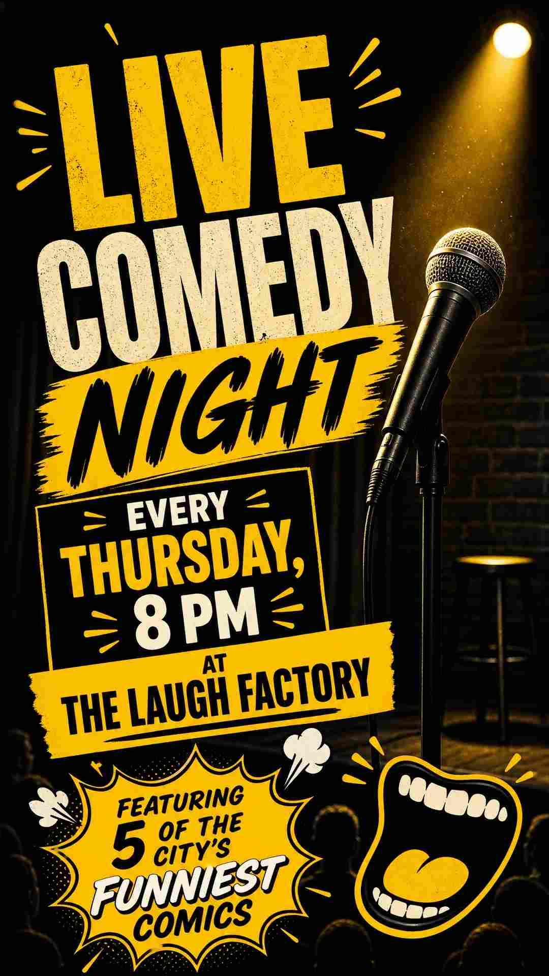
5. The details fall apart when you look closely. Zoom in and AI shows its hands, literally. Warped fingers, melted letters, faces that are almost right but land in the uncanny valley. The poster reads fine from a scroll, then breaks the moment someone actually looks.
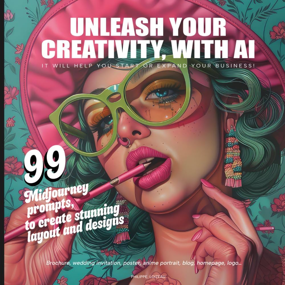
6. It has AI's identity, not yours. Before anyone reads a word or spots your logo, they should unconsciously know a design came from you. The posters above actually do have a strong identity, it's just AI's identity, not the creator's. Anything that makes your work yours gets flattened into the same generic look everyone else's prompts produce.
Key insight: AI doesn't have taste, it has an average. Every poster it makes carries its identity, not yours.
Why does AI design look off even when it's detailed?
Because detail is not the same as design. AI is very good at generating more, and design is mostly about deciding what to remove. The same instinct shows up in text, which is why AI writing has its own tells you can learn to strip out. Once you train your eye on the visual version, you start applying the same edit everywhere: fewer fonts, more space, one consistent style, and a color palette that actually belongs together. That discipline is also what keeps your own social graphics on-brand instead of looking like everyone else's.
None of this means AI is useless for design. It means raw AI output is a starting point, not a finished poster.
Part 2 is here, where I show you how to actually use AI for graphic design and prompt it so it doesn't look like AI. Save this one too, so you can gut-check your next poster before it goes out.
Additional Reading
Here are some related guides to check out:
Frequently asked questions
- How can I tell if a poster was made with AI?
- Look for too many inconsistent details fighting for attention: no white space, mismatched fonts, clashing art styles in one image, and details that fall apart up close. Most AI posters trip at least three of these. Once you know the pattern, you can spot it in about a second.
- Why does AI graphic design look bad even when it is highly detailed?
- Detail is not the same as design. AI is built to generate more, but good design is mostly about deciding what to remove. So you get a technically polished image that feels crowded and generic because nothing was cut or prioritized.
- Is it okay to use AI for graphic design at all?
- Yes, as long as you treat the output as a starting point and not a finished poster. Raw AI results carry AI's visual identity, not yours, so you still need to edit for white space, consistent fonts, one style, and your own brand. Part 2 covers exactly how to prompt for that.
- What is white space in design and why does it matter?
- White space is intentional empty area around and between elements. It gives the eye somewhere to rest and signals what matters most. AI tends to fill every pixel, which is why its posters feel chaotic and overcrowded.
Want to build your first AI agent?
Build Your First Agent 101 is the next step! You'll get step by step guides, video tutorials and starter prompts to create your first agent in half a day, customized to your own workflow.
Learn more