How to Fix AI-Looking Graphic Design and Posters

Co-founder at King’s Cross Labs · ex-LinkedIn PM & Forbes 30 Under 30
Send this guide to yourself
Get the link in your inbox so you can read it whenever you're ready.
Your email will also be saved for future updates.
Most AI posters look AI for one reason: the prompt asked for "a nice poster" and left everything else to the model. Give it a real design style, a fixed layout, and a tight palette, and the tell mostly disappears. Part 1 showed you the ways to spot AI-made design. This one shows you how to fix it, plus 5 prompt templates you can copy.
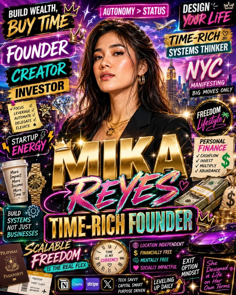
Why this matters
Once you can spot the tells, the fix comes down to one thing: direction beats the tool. The same ChatGPT that spits out a plastic, teal-and-orange, gibberish-text poster will make something you would actually print, if you tell it what "good" means. The gap is never the model. It is the vocabulary. Once you can name the five things that make a graphic read as AI, you can fix them in one prompt.
How to fix AI-looking content
You fix an AI-looking graphic by naming a style, showing it real examples or your brand, tightening the palette, setting real type hierarchy, and adding the text yourself. Each move targets a specific tell: no named style, no reference to match, too many colors, flat generic type, and garbled text. Here is how to handle each one.
Start with real direction
1. Name a design style, not "make it look good." The single biggest AI tell is no style at all. Give the model a movement, era, or medium it has seen thousands of real examples of: Swiss (International Typographic Style), Bauhaus, mid-century travel poster, 1970s risograph, 90s rave flyer. A named style pulls the output toward real design instead of the default AI mush.
2. Give it real examples, not just words. Words like "modern" or "clean" mean almost nothing to the model on their own. Show it what you mean instead: paste in a poster you like, screenshots of existing components, or a style you want it to match. Better yet, hand it your brand.md, a single file with your company's brand guidelines and examples, so it designs in your own style instead of a generic one.
3. Write a one-line brief. This is the "[what it's for]" half of the formula. A poster for a Tuesday jazz night should not look like a SaaS launch. State the purpose, the audience, and the one message in a single sentence before the STYLE block. Direction upstream fixes ten small problems downstream.
Control the craft
4. Lock the palette to two or three named colors. "Vibrant and eye-catching" is how you get the teal-orange gradient soup that reads as AI instantly. Name exact colors, or hex codes if you have them. Fewer colors almost always look more designed. If you need help choosing, run your image or brand through a color palette analysis prompt first.
5. Set real type hierarchy. AI loves to make everything one size in one generic sans-serif. Name a font style and a hierarchy: a big headline, a small kicker above it, a tiny footer. Even "bold condensed display type for the title, light sans for the details" gives the model something to structure around.
6. Give negative space a job. AI fills every inch by default. Tell it to leave room: "60 percent negative space, one focal element." Breathing room is one of the fastest ways to make a graphic look intentional instead of generated.
7. Add the text yourself. AI still garbles typography, with warped letters, invented words, and off kerning. Do not fight it. Either keep any AI text to a few words inside quotation marks, or generate the poster as the art with the headline area left clear, then set the real copy in Canva or Figma. This one habit fixes the most obvious AI tell in seconds.
How do you prompt for a poster that does not look AI-generated?
You prompt for it with a style brief, not a wish. ChatGPT can make genuinely good posters. What separates a sharp one from an obviously-AI one is how much direction you hand it, and the templates below carry that direction for you. Copy one, drop in your own details, and you have a poster.
The formula: [what it's for] + [STYLE block]. The bracketed part is yours to change every time. The STYLE block after it is the part you leave untouched, since that is what locks in the look you can reuse again and again.
Run it in three moves:
- Pick a style. Scan the templates below and grab the one that suits your brand or post.
- Paste it into ChatGPT. Turn on image generation (ChatGPT Images / GPT-4o) and send it. One prompt gives you one poster.
- Swap the bracket. Trade the example for your own product, event, or brand, and leave the STYLE block exactly as written.
Every template runs on this formula and is written to sidestep the AI tells above.
Prompt 1 — Swiss editorial poster (kills clutter)
Create a poster for [what it's for]. STYLE: International Typographic Style (Swiss design), strict grid, left-aligned, one bold Helvetica-style sans-serif, strong type hierarchy, 60% negative space, two colors only [color 1] and [color 2], flat matte print finish, no gradients, no 3D, no glow. Portrait 4:5. Leave the headline area clear so I can add text myself.Example:
Create a poster for a Tuesday-night jazz set at a Brooklyn wine bar. STYLE: International Typographic Style (Swiss design), strict grid, left-aligned, one bold Helvetica-style sans-serif, strong type hierarchy, 60% negative space, two colors only deep burgundy and cream, flat matte print finish, no gradients, no 3D, no glow. Portrait 4:5. Leave the headline area clear so I can add text myself.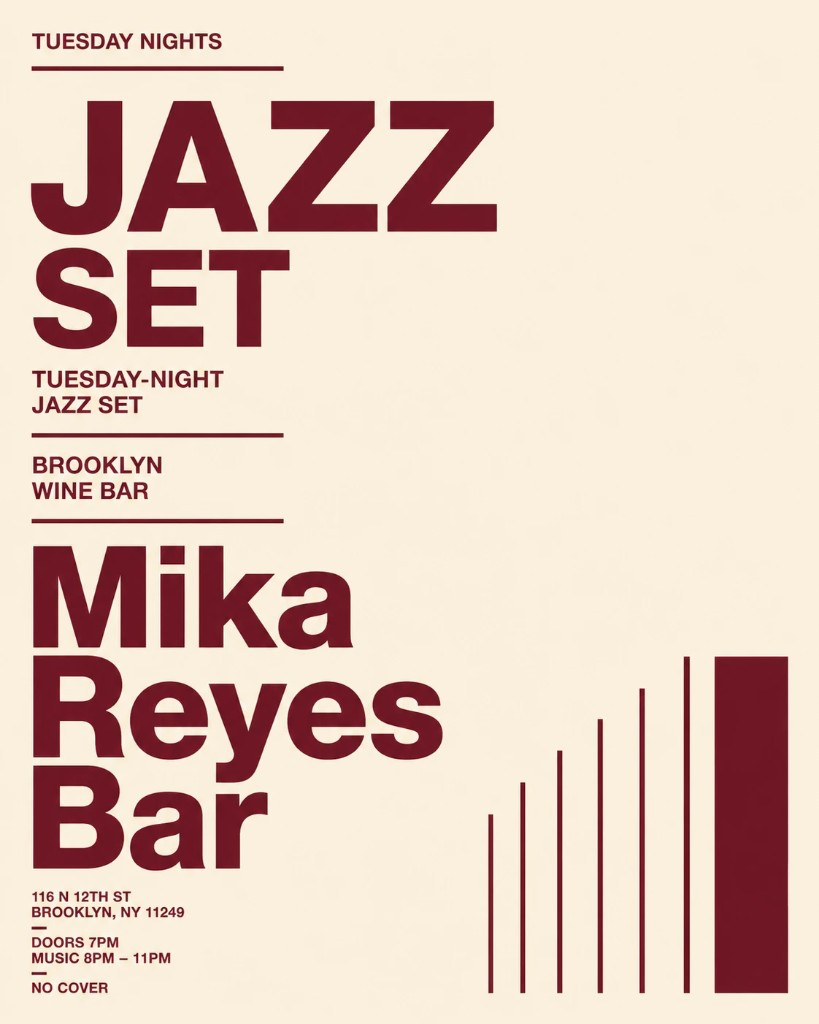
Prompt 2 — Retro risograph print (kills the plastic sheen)
Create a poster for [what it's for]. STYLE: 1970s risograph print, two-ink overprint in [color 1] and [color 2], visible paper grain and halftone dots, slight misregistration, bold condensed display type, off-white paper background, no digital gloss, no gradients. Portrait 4:5.Example:
Create a poster for Mika Reyes (timerich founder). STYLE: 1970s risograph print, two-ink overprint in 2 colors only, visible paper grain and halftone dots, slight misregistration, bold condensed display type, off-white paper background, no digital gloss, no gradients. Portrait 4:5.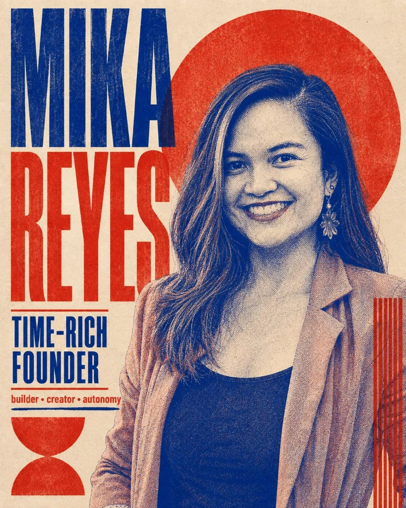
Prompt 3 — Modern event graphic (bold hierarchy, named palette)
Create a poster for [what it's for]. STYLE: modern editorial with mid-century travel poster influence, limited palette of [color 1], [color 2], and [color 3], flat illustration, one strong focal image, clear headline-kicker-footer hierarchy, generous margins, offset print texture, no photorealism, no glow. Portrait 4:5. Leave the top third clear for a headline I will add later.Example:
Create a poster for a founder meetup on AI and freedom. STYLE: modern editorial with mid-century travel poster influence, limited palette of navy, mustard, and off-white, flat illustration, one strong focal image, clear headline-kicker-footer hierarchy, generous margins, offset print texture, no photorealism, no glow. Portrait 4:5. Leave the top third clear for a headline I will add later.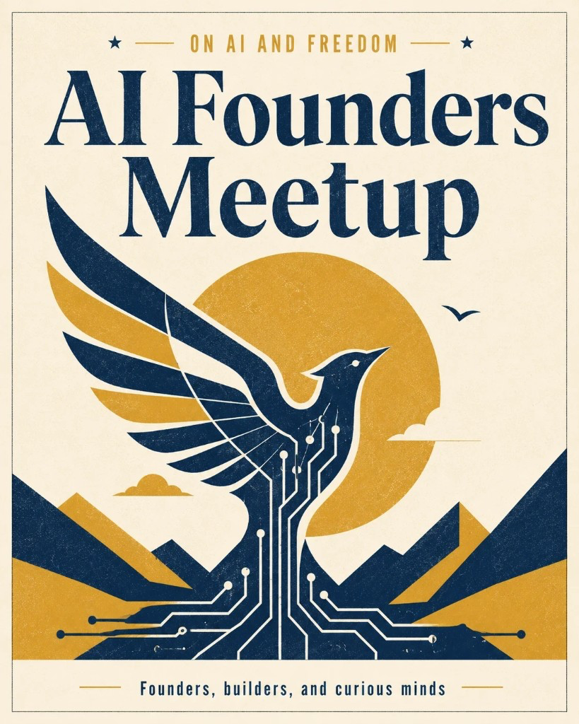
Prompt 4 — Bold color pop (loud without the AI soup)
Create a poster for [what it's for]. STYLE: bold neo-brutalist pop poster, flat color blocks in three saturated colors [color 1], [color 2], and [color 3], high contrast, oversized heavy sans-serif, thick rules and geometric shapes, hard edges, no gradients, no 3D, no glow, flat print finish. Portrait 4:5.Example:
Create a poster for Mika Reyes, time-rich AI founder. STYLE: bold neo-brutalist pop poster, flat color blocks in three saturated colors electric blue, hot pink, and lemon yellow, high contrast, oversized heavy sans-serif, thick rules and geometric shapes, hard edges, no gradients, no 3D, no glow, flat print finish. Portrait 4:5.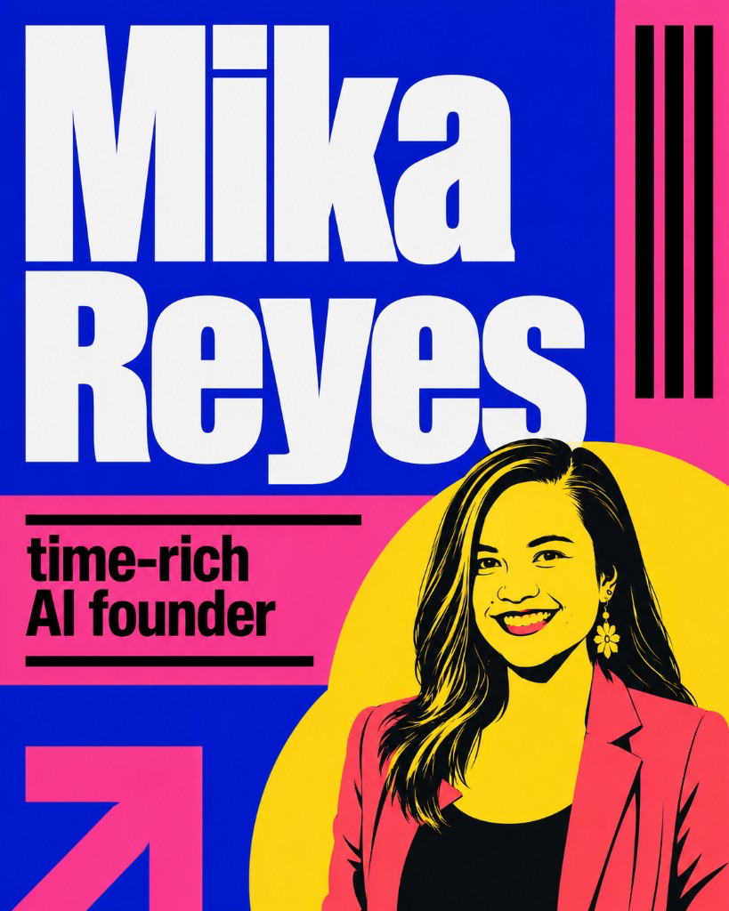
The boldness comes from flat blocks of a few saturated colors, not from gradients or glow. Name the exact colors so ChatGPT does not fall back to its default teal-orange look. Want a different flavor of loud? Swap the STYLE line for "Bauhaus poster, primary red yellow and blue, geometric shapes" or "1980s Memphis design, playful shapes and squiggles."
Prompt 5 — Infographic (for steps and data)
Create an infographic layout for [what it's for]. STYLE: clean flat vector infographic, [number] clearly separated sections on a grid, simple consistent line icons, limited palette of [color 1], [color 2], and a neutral background, generous spacing, clear hierarchy from title to sections. Leave the numbers and labels blank so I can add real data myself. No gibberish text, no fake charts. Portrait 4:5.Example:
Create an infographic layout for "How to Spot AI Posters: 6 common signs." STYLE: clean flat vector infographic, six clearly separated numbered sections on a grid, simple consistent line icons, limited palette of navy, coral, and an off-white background, generous spacing, clear hierarchy from title to sections. Leave the numbers and labels blank so I can add real data myself. No gibberish text, no fake charts. Portrait 4:5.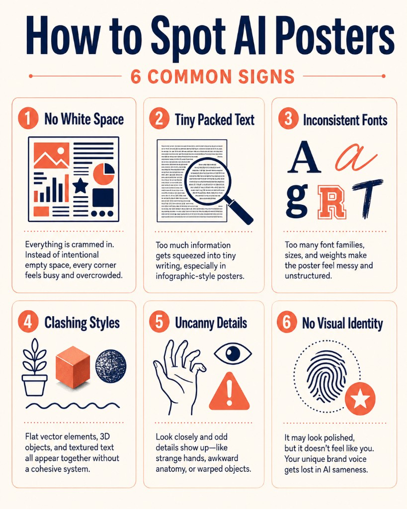
Infographics are where AI does the most damage, because it invents numbers and garbles labels. So use it for the frame only: the grid, the icons, and the color system. Keep every real stat and label out of the prompt and add them yourself in Canva or Figma once the layout looks right.
If you want the same swap-the-bracket approach for social slides, the carousel generator workflow uses the same idea for Instagram, and Claude Design for graphics and branding shows how to turn inspiration into a reusable brand kit before you ever prompt.
Additional Reading
Here are some related guides to check out:
Frequently asked questions
- Why do my AI posters look fake?
- They look fake because the prompt gave no real direction. Name a specific design style, lock the layout and palette to a few choices, and most of the AI look disappears.
- Can I fix the garbled text in AI posters?
- Yes. Keep any AI text to a few words in quotation marks, or generate the poster as art with the headline area left clear, then add the real text yourself in Canva or Figma.
- Which AI tool is best for making posters?
- ChatGPT with GPT-4o image generation handles most posters well. The tool matters far less than the direction you give it, so a clear style brief beats switching tools.
- Do I need design skills to prompt for a good poster?
- No. You need the vocabulary, not the craft. Naming a real style like Swiss design or risograph print, plus two colors and a layout, does most of the work for you.
Want to build your first AI agent?
Build Your First Agent 101 is the next step! You'll get step by step guides, video tutorials and starter prompts to create your first agent in half a day, customized to your own workflow.
Learn more