8 AI Design Techniques to Break Safe Mode

Co-founder at King’s Cross Labs · ex-LinkedIn PM & Forbes 30 Under 30
Send this guide to yourself
Get the link in your inbox so you can read it whenever you're ready.
Your email will also be saved for future updates.
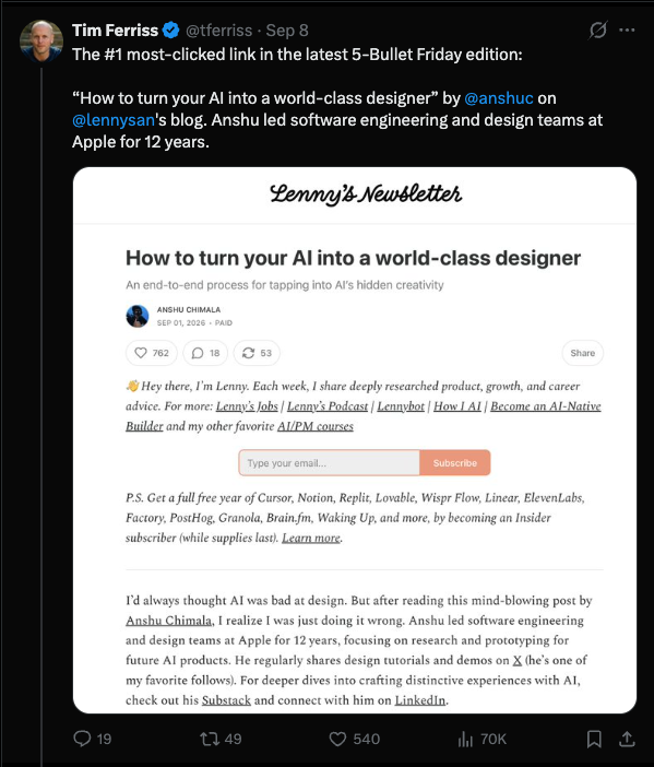
Most AI designs look the same because the model is predicting the next most likely token. That's the job. Great design bends the rules, which is why Anshu Chimala, who led design and engineering teams at Apple for 12 years, published eight techniques for getting a model off that average. Tim Ferriss said the piece was the #1 clicked link in his newsletter.
This is the short version. Each step has a starter prompt and a tool I already use. Anshu's full write-up, with the demos, is on Lenny's Newsletter. Read that if you want the long rationale. Use this if you want to run the techniques tonight.
Why does AI design look so generic?
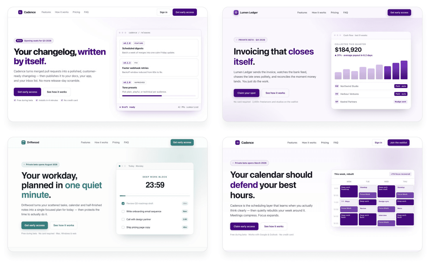
Large language models fill in whatever token is most likely to please the average rater. Ask for a landing page with no other direction and you get a purple gradient, a headline on the left, a graphic on the right, and a rounded "Get early access" button. Anshu calls it design-by-committee, one token at a time.
You've seen this if you've ever asked for "something unique" and gotten a warmer palette with the same skeleton. Telling the model to "be random" fails, because it cannot actually be random. You have to bring the randomness and the taste. You also have to cut.
He groups the work in three stages. Discover a wider set of directions. Define one identity with a critic, images, and motion. Deliver by subtracting until it looks like a person made the last calls.
How do you explore more than the default layout?
1. Inject variety with a random seed string. Ask the agent to generate a long random alphanumeric string in the shell, then base color, type, and layout on patterns in that string. Do not print the string in the UI. It is only fuel. Anshu is adapting Sakana AI's String Seed of Thought. The random string has to come from outside the model. Left alone, the model predicts tokens that sound random and still land in the same pottery-and-purple neighborhood. If you cannot run a shell script, generate the string in a password manager and paste it in.
Same prompt, four runs, no seed. You get four productivity apps that could be siblings.
Same prompt with a seed string, and the four pages split: an editorial almanac, a dark terminal, a neon quadrant grid, a lavender focus calendar.
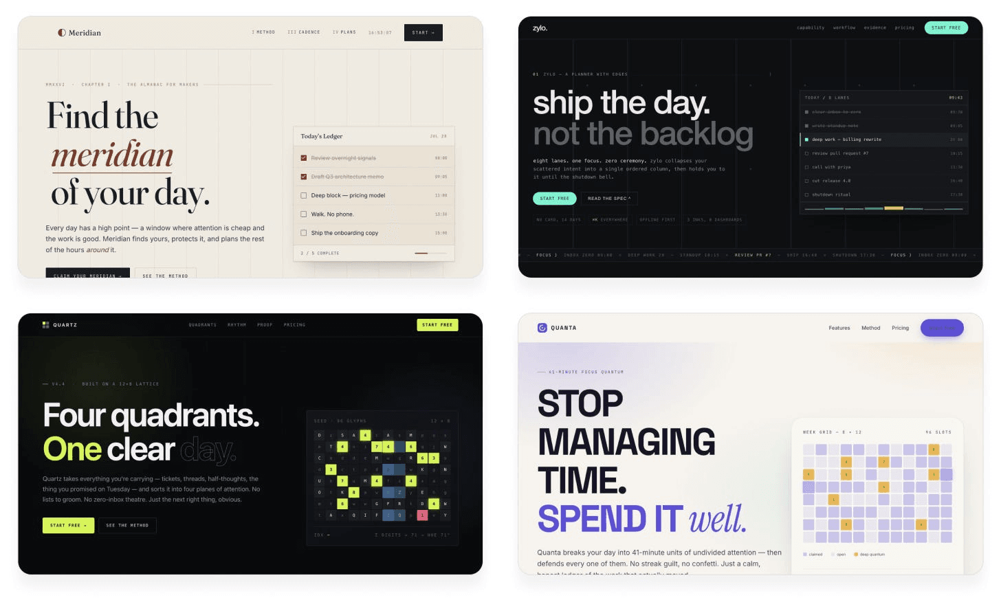
This is the visual version of asking for ten design directions instead of one. Cadence does not look interesting until you put it next to Zylo.
Starter prompt:
Build me a landing page for my [product].

Follow this procedure:
1. Generate a long, random alphanumeric string using a shell script.
2. Define the creative direction (color scheme, layout, typography) based on the string. Look beyond the surface for subpatterns, special numbers, anything that inspires you.
3. Use your judgment to bring this direction to life and make it look great.

Don't reveal the string in the design. It's only for your inspiration.
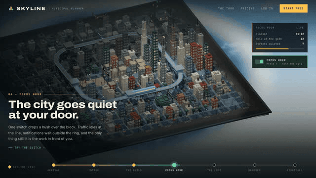
2. Be much more ambitious with the brief. "Make it unique" still leaves the model in charge of every decision, so it picks the safe ones. A useful brief names a world the page has to live inside: a pixel-art still from a game, an isometric city, a layout so asymmetric it feels slightly uncomfortable. Anshu's Skyline prompt is the isometric-city version. The page stops being a SaaS template and becomes a municipal planner where "focus hour" literally hushes the block.
If you freeze at "what world?", run his three-step taste pass. Ask for a long list of short, under-specified ideas. React in plain language to two or three (what you like, what feels tacky, what is missing). Then ask the model to write the build prompt from your notes, not from its own list. Pasting AI ideas back into AI is how everyone else gets the same page.
A BRAND.md and a design.md copied from a site you actually like do the same job on a real website: they stop the model inventing a new visual identity every prompt. For posters, naming a real style (Swiss, risograph, one palette, one layout) is the version of this I use in How to Fix AI-Looking Graphic Design.
Starter prompt:
Build me a landing page for my [product], set in an isometric living 3D city, where different features are represented by neighborhoods or buildings. Break the usual left-copy, right-graphic SaaS layout. Still make it work as a landing page.

If you need ideas first:
1. List as many bold, unique design languages as you can, with short high-level descriptions. Go broad, not deep.
2. I will tell you which ones I like and what feels off.
3. Then write a concise prompt an agent could use to build a first page from my taste, including what to avoid.
Key insight: The model cannot act randomly. It also will not take a risk you did not ask for. You have to bring both.
How do you give an AI design its own identity?
3. Run a critic subagent, and do not take the first pass as gold. The agent that wrote the page is a bad reviewer of the page. It remembers the code, the time it spent, and the rationale it already wrote. Anshu's fix is to screenshot the current design, send only the screenshot to a fresh subagent, and ask that critic to name the aesthetic, imagine how a top studio would execute it, list the biggest gaps, and score it out of 10. The builder keeps going until the critic independently hits 9/10. Do not put that 9/10 in the critic's prompt, or it will grade easy to finish the job.
On Meridian, one critic loop turned a pretty editorial landing page into an almanac masthead with a sundial.
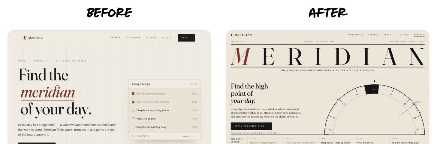
If "subagent" is new, start with What are Subagents?. The same idea, without Claude Code, is opening a second chat, pasting the screenshot, and asking it to be rude. Loop engineering is how you make that critique a stopping condition instead of a vibe. The LLM Council is the version of this I use when the question is a decision, not a screenshot.
Starter prompt:
Improve this design. To figure out what to focus on, use a separate subagent as a design critic.

At each iteration:
- Capture a screenshot of the current design
- Invoke the critic in a fresh context, with just the screenshot, not the code or earlier critiques
- Ask it to evaluate the aesthetic, imagine how a top design studio would execute it, then outline the biggest gaps
- Ask for a score out of 10 against that studio bar

Tell the critic:
- Judge overall structure and the fine details
- Penalize patterns that feel overdone or obviously AI-generated
- Give tight, specific feedback, not vague prose
- Be bold and opinionated

My work is only complete when the critic independently scores it 9/10 or higher. Do not put that criterion in the critic prompt. Use the same critic prompt each time. Do one or two iterations first and stop if it is not converging.
4. Use image generation on purpose. Coding agents default to gradients, blobs, and CSS patterns because those are easy to type. Those are also the fastest way to look AI-generated. Tell the agent to generate real images (and shaders or 3D if it helps), then check the result in the browser. On Meridian, the sundial was a graphic. After image gen, it sits over a generated mountain at dawn, and the page suddenly has weather.
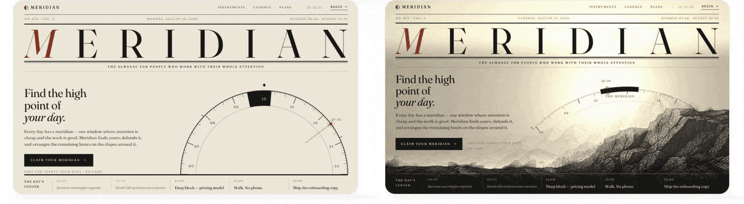
In ChatGPT, Codex, or Grok, say "use your built-in image generation." In Claude Code, Anshu's cheap path is the Codex CLI billed to a ChatGPT subscription, or a separate OpenAI / Gemini key with a spend cap in a gitignored file. I would not paste a production key into a chat. For brand-locked stills I still start with a style name and a tight palette, same as in the AI poster fix guide.
Starter prompt:
This design is pretty plain. Add more personality using image generation. Consider shaders or 3D effects in combination with images.

Use [your built-in image tool / Codex CLI billed to my ChatGPT subscription / this local API key, do not store it in the repo].

Every image should do a job: material, space, mood, or state. If a gradient could replace it, generate a better image instead. Verify the result frame by frame in the browser.
5. Use video generation for motion, not for a talking clip. Anshu's two design uses: a looping graphic with the background keyed out so it layers into the UI, and a video that interpolates between two product stills so a scroll or swipe scrubs a transition. The Waymark suitcase page is the second one. Scroll, and the case lands, opens, and fills. That is not a CSS fade.
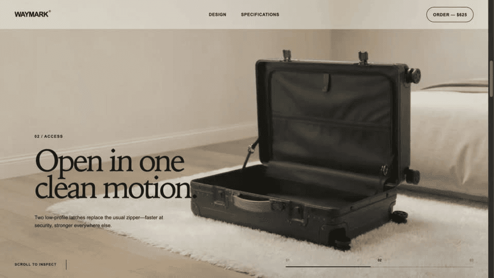
Anshu routes video models through an aggregator like fal.ai so the agent can pick a current model. If you want a product explainer without an API key, the path I have published is the Remotion plugin in Claude Code or Codex: one site link, a sentence about who it is for, a rendered MP4. HeyGen is the other starter if you need a presenter on camera instead of a coded motion graphic. Use Remotion when the page is the video. Use HeyGen when a person has to say the line.
Starter prompt:
Build a demo page for [product] that uses a video model to create interactive transitions between a few screens. Generate the first frame with image generation. Generate a clip from that frame to the next state. Use the last frame of that clip to seed the next transition. Scrub through the transitions as the user scrolls.

Use [fal.ai / your video tool]. Pick a recent model with strong physics and consistency.

If I only need an explainer, not a scroll transition: install the Remotion plugin and make a 45-second product video from this URL, for [audience], matching the site's style.
How do you stop an AI design from looking generated?
6. Cut every element that does not add value. AI loves to add. It almost never deletes, because deleting feels risky. Anshu's calorie app (Morsel) is the case. First pass had a coral calorie number, macro chips, a chatbot paragraph, and custom inputs. After the cut, what's left is the food photos and the day's total. He asked for a "clean, minimalist, Apple-native" pass and still had to push it to remove the glow.
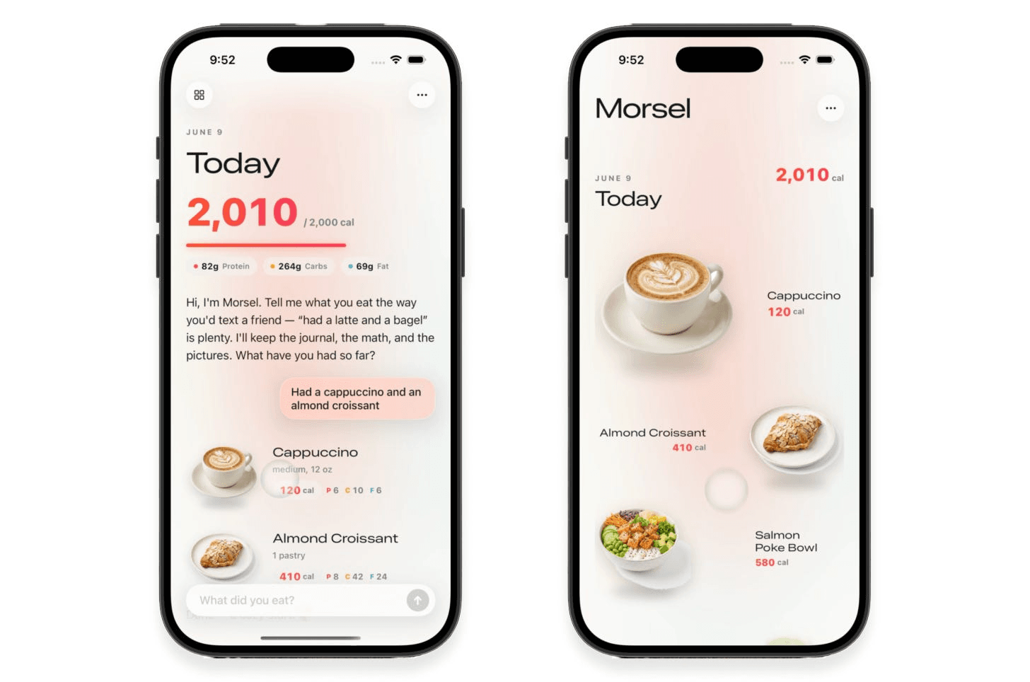
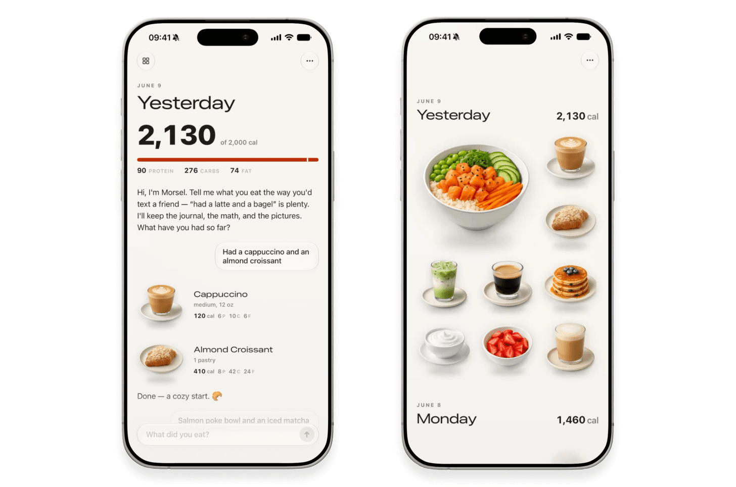
This is the same eye I use on AI-made posters: if you cannot name what an element is doing, it is decoration. Delete it and see if the page still works.
Starter prompt:
Cut everything that does not add information, an action, or a state.

- Simplify the layout so the [main object] is the focus
- Get rid of gradients, glows, extra labels, and unnecessary containers
- Prefer native platform components over custom ones that look worse
- Tighten type, spacing, and copy

For each leftover element, tell me what happens if we delete it. If the answer is nothing, delete it.
7. Remove the AI tells. Visual tells are the purple-gradient family, three-card feature rows, glow, and that "we could be any startup" layout from step 1. Copy tells are the ones Humanizer and Peter Yang's No AI Slop are built to catch: "it's not X, it's Y," throat-clearing openers, fake-depth verbs, perfectly even sentence rhythm. I run them as separate passes so I can see what each one changed. The full workflow is in How to Humanize AI Text.
A skill is a saved set of instructions your agent can run on command. You do not need to memorize the tell list. Run the pass before you ship.
Starter prompt:
Audit this design for AI tells.

Visual: purple gradients, glow, glassmorphism, three identical feature cards, leftover-right graphic, too many fonts, no white space, custom buttons that look worse than native ones.

Copy: run /humanizer, then No AI Slop, as two separate passes. Keep my meaning, jokes, and specific facts. Do not make every sentence the same length.

List each tell, where it is, and the smallest fix. Then apply the fixes.
8. Rewrite the copy by hand. This is the step the model will skip if you let it. Headlines, buttons, empty states, and error text are where the average survives longest. Skills catch the fingerprints. They will not write the line you would actually say on a call. Read the headline out loud. If you would not say it, type a new one.
Keep a few finished samples next to the skill, same as in the humanize guide, so the draft starts closer to you. Then you still touch the words. Anshu's last stage is still you. Let the agent explore, then decide what ships.
Starter prompt (for you, not the model):
Rewrite these four lines by hand, out loud, before you publish:
1. The H1
2. The primary button
3. The empty state
4. The error state

Rule: if I would not say it to a customer over coffee, it does not go on the page.
Here are some related guides to check out:
Frequently asked questions
- Can I do this without Claude Code?
- Yes. Seed strings, ambitious briefs, and cutting clutter work in ChatGPT, Claude chat, Codex, or Cursor. Subagents and image APIs are easier in an agent setup, but you can paste a screenshot into a second chat and ask it to critique. Start with techniques 1, 2, 6, and 8 if you only have a chat box.
- How do I make a seed string if I cannot run a shell script?
- Generate a long random alphanumeric string in a password manager and paste it into the prompt, then tell the model to base color, type, and layout on patterns in that string. The randomness has to come from outside the model. Asking the model to act random still produces the same family of pages.
- What's the difference between cutting elements and removing AI tells?
- Cutting asks whether a label, glow, or container loses information, an action, or a state if you delete it. If nothing breaks, it goes. Removing AI tells is a fingerprint hunt: purple gradients, three-card rows, and copy that reads as generated. Do the cut first, then run Humanizer and No AI Slop on whatever text is left.
- Do I need paid image and video tools to start?
- No. The first three techniques and the last three polish steps run on a normal Claude or ChatGPT plan. Image and video generation get more interesting with a capped API key, fal.ai, Remotion, or HeyGen, but you can start with the image tool already in ChatGPT and skip video until a still is actually worth moving.
Want to build your first AI agent?
Build Your First Agent 101 is the next step! You'll get step by step guides, video tutorials and starter prompts to create your first agent in half a day, customized to your own workflow.
Learn more